Understanding the user
User research: summary
I conducted interviews and created empathy maps to understand the users
I’m designing for and their needs. A primary user group identified
through research was elderly students with absolute lack of confidence
and the fear of fraud regarding digital money transactions.
This user group confirmed initial assumptions about Da Vinci School of
Arts students, but research also revealed that distrust was not the only
factor limiting users from buying courses. Other user problems included
a wide population of elderly students with very little overall
experience using apps.
User’s
pain points
Distrust
Lack of confidence and fear of fraud regarding digital money
management methods.
Accessibility
Elderly users have trouble understanding affordances and cues, such
as 3 dots or burger menus. Elderly users are also not familiar with
gestures to move through an app.
IA
Most users have a hard time completing tasks using top or bottom
menus and prefer taping on payment methods images and courses
content cards to move through the app.
Support
Users feel frustrated when they can’t easily find access to human
support center.
Meet the User

User problem
statement
“I am concerned that I may be an easy target for digital fraud”.
Goals
- Understand new technologies.
- Access services without leaving the countryside.
- Feel reassured when paying for something through an app.
Frustrations
- Insecure when learning to use an app with unfamiliar icons.
- Scared that apps are not safe enough to pay for things.
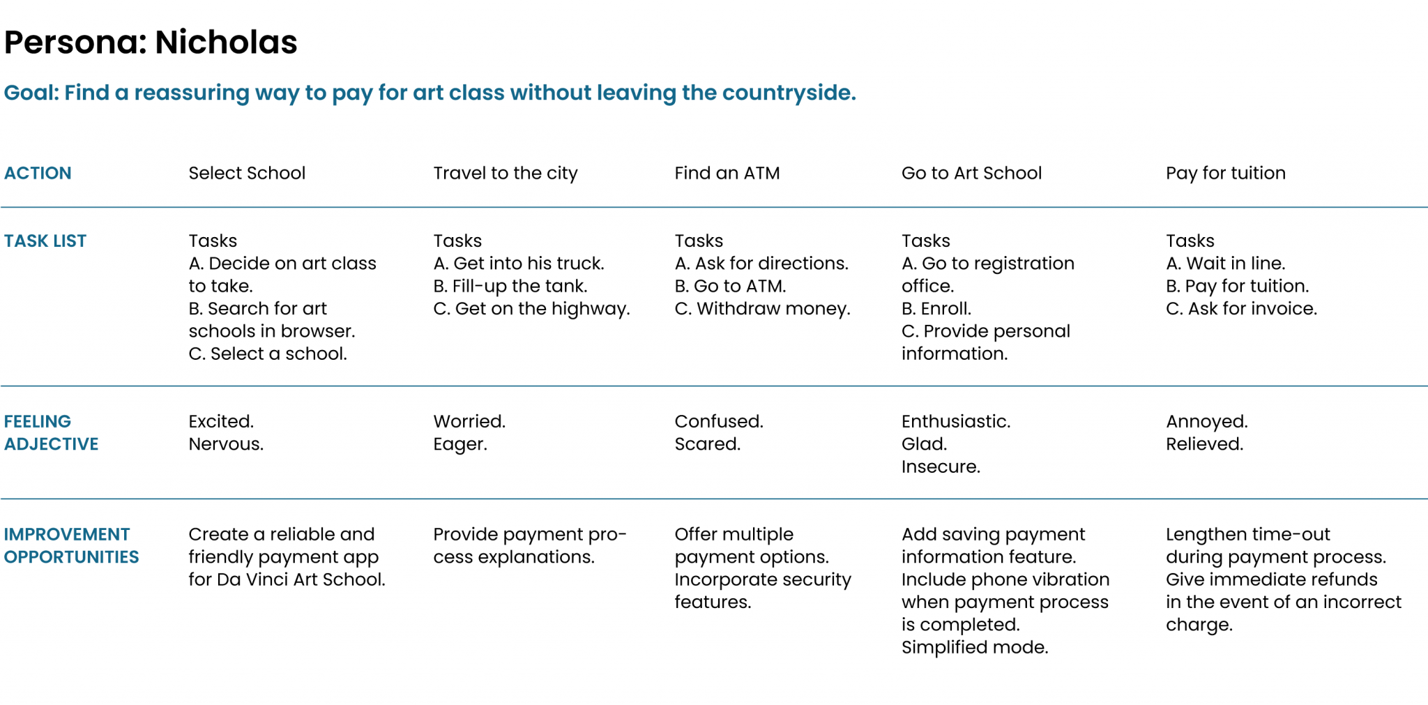
Nicholas is a retired lawyer who needs an easy app experience to pay for an art class because he is not technologically savvy and is afraid of digital fraud.
Nicholas lives in the countryside in Salta, Northwest Province in
Argentina. He lives with his wife Liliana. His children have moved
to the city years ago so he and his wife must constantly learn about
technologies that they cannot fully understand. Recently Nicholas
has retired, therefore he has a lot of free time and he is thinking
about learning how to build wood sculptures. Due to his age and
where he lives, he doesn’t have much experience in handling apps but
he knows he needs them. He gets anxious and scared when he isn’t
sure about paying for something online. He needs an easy-to-use
system for an elderly person.
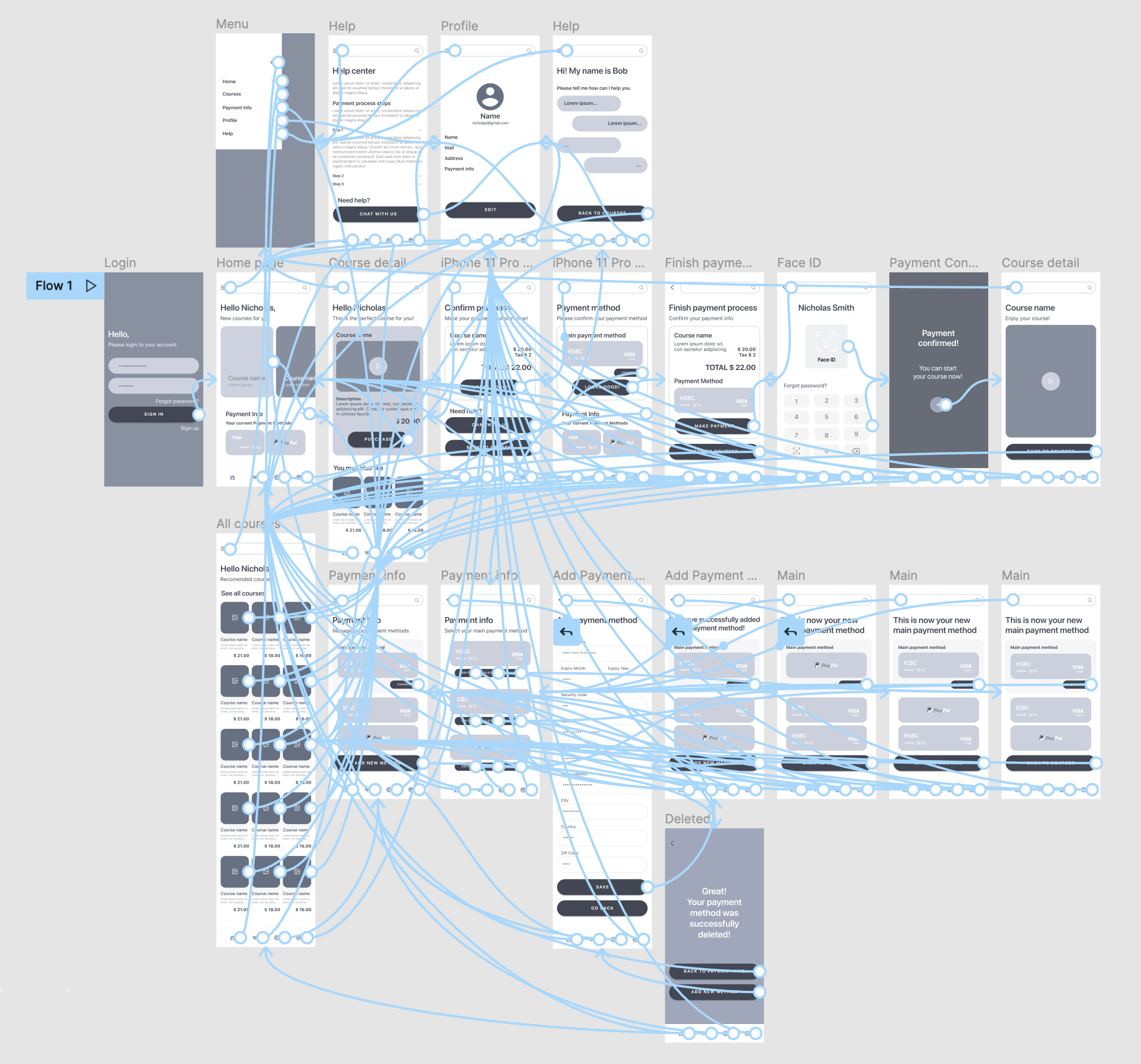
User Journey Map
Mapping Nicholas’s user journey revealed how helpful it would be for
Da Vinci School of Arts elderly students to have access to a
friendly and reliable payment app.
Competitive Analysis
We looked at several potential competing companies, and although
none compete directly with etvoilà!, they can still infringe on the
business’ revenue & popularity.
Some opportunities we identified include:
- Provide assistive technology such us compatibility with screen
reader technologies.
- Enhance security features.
- Include language accessibility.
- Build loyalty through reward programs.
Starting the design
Paper wireframes
For the first version of etvoilà! home screen, I prioritized the
search of Art Courses available to buy. I included strong cues to
make payments and edit payment methods. The goal was to help users
gain trust in the payment process. Being able to see all the screens
of the app on paper, helped me prioritize the most relevant features
to start working on the digital version.
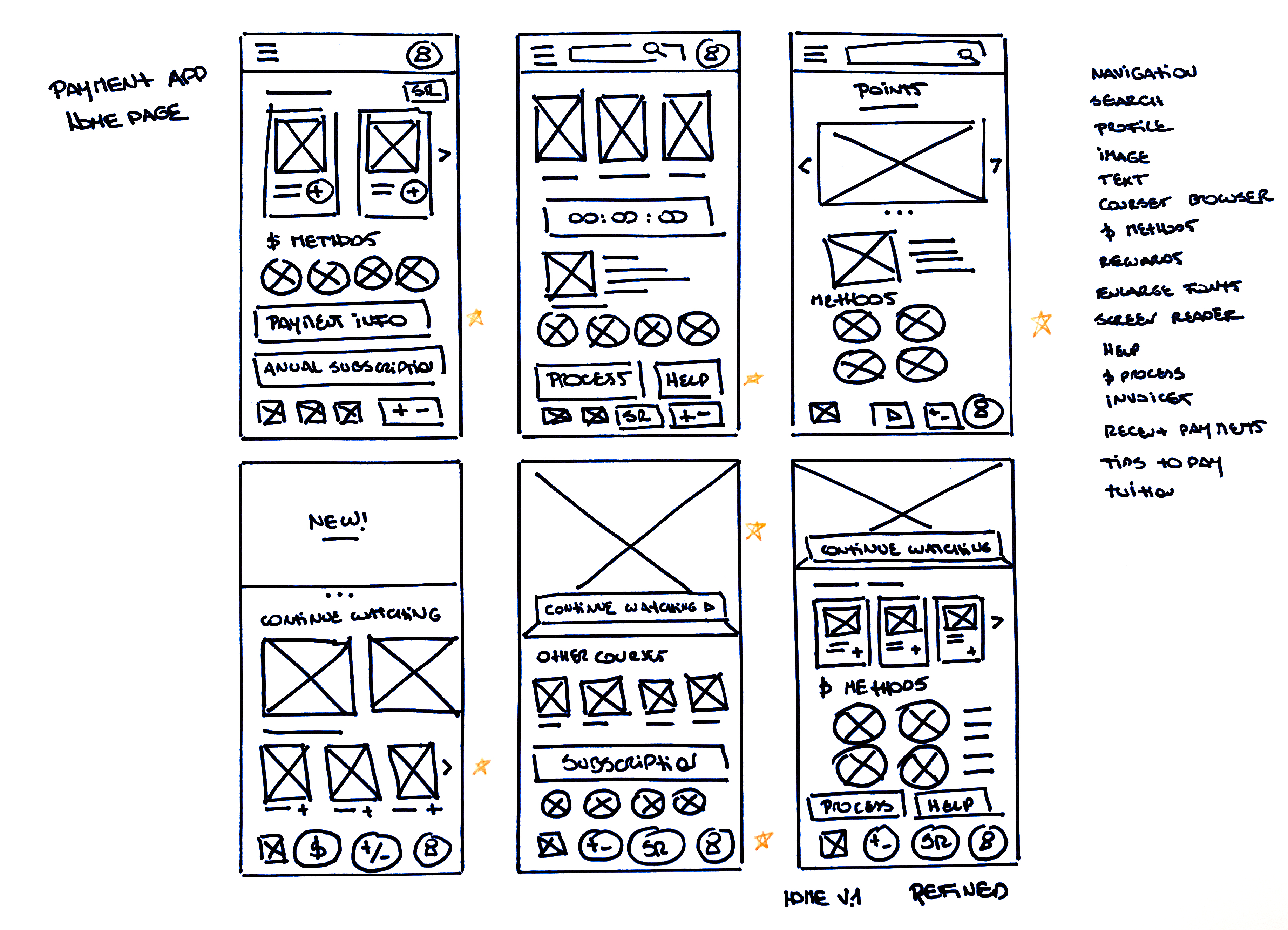
I marked the elements of each sketch that I
thought I could use in the digital wireframes.
Digital wireframes
Prototype #1
After the interviews process and considering all my findings, I made
sure to give users clear cues to access the Payment Info Section.
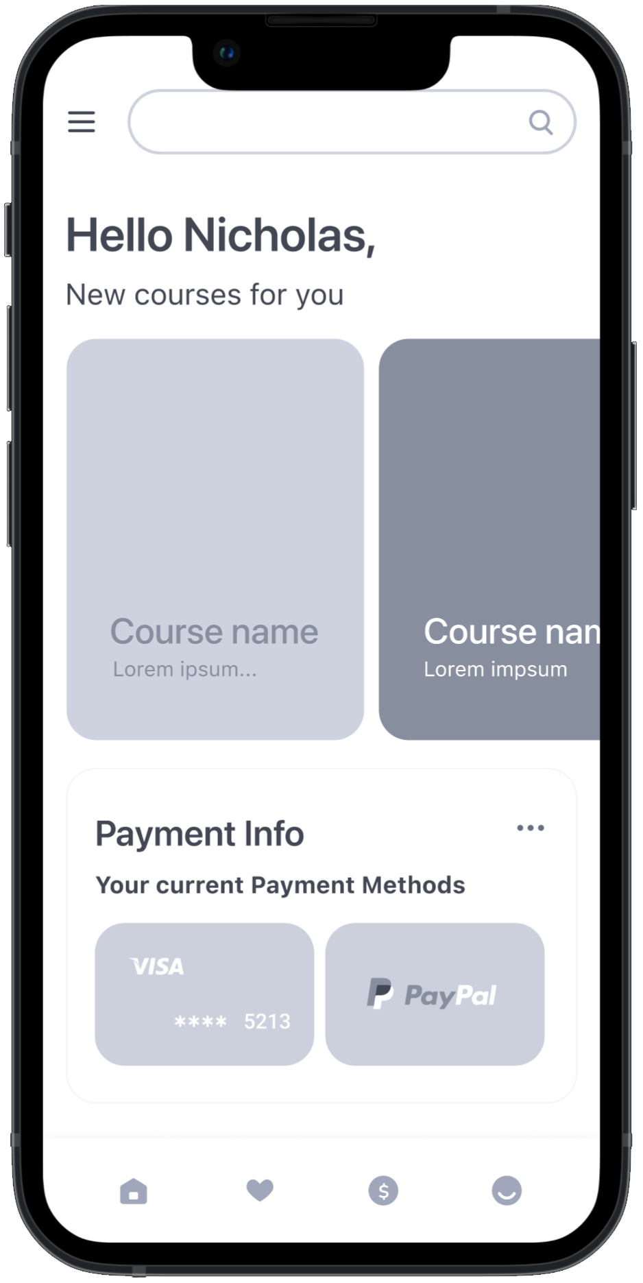
During the initial design phase, I worked on a very
minimalistic version of the app. Te goal was avoiding the use of
elements that could distract users form easily making a payment.
- Burger menu with access to every screen in the app.
- Carrousel with the School’s basic course offering.
- 3 dots menu to access payment information.
- Minimalistic footer menu to make it easy for users to navigate
through the app.
At this stage on the design process, and before running the
first usability study, users had a Main Payment Method that they
could change during the Payment process.
Big buttons with large text was a key user need to address in
the designs.
- Having a saved Main payment method in the user’s account could
help simplify the payment process.
Prototype #2
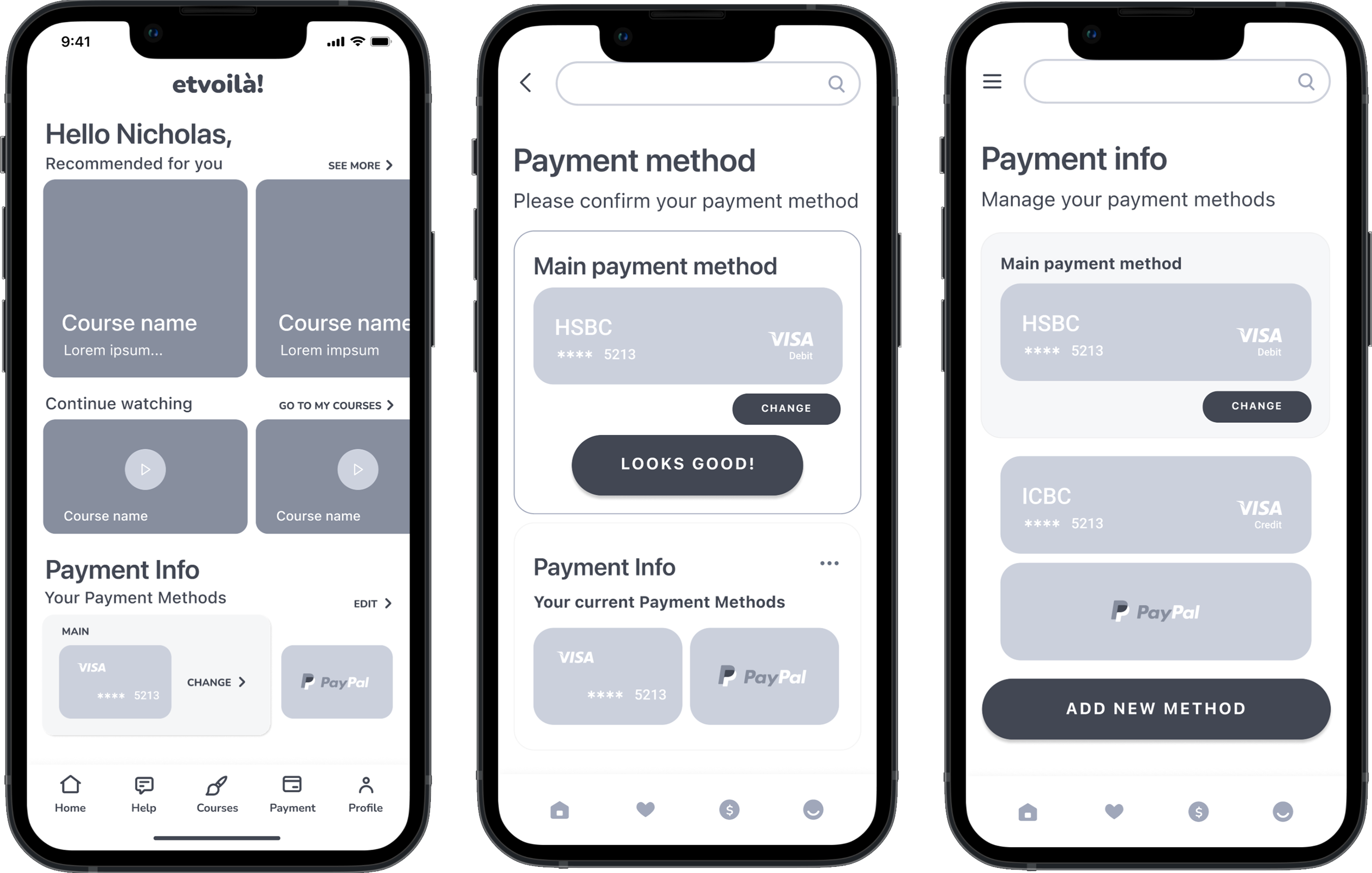
Low-fidelity prototype
At this stage on the design process, and before running the first
usability study, users had a Main Payment Method that they could
change during the Payment process. Big buttons with large text was a
key user need to address in the designs.
 LO-FI
LO-FI
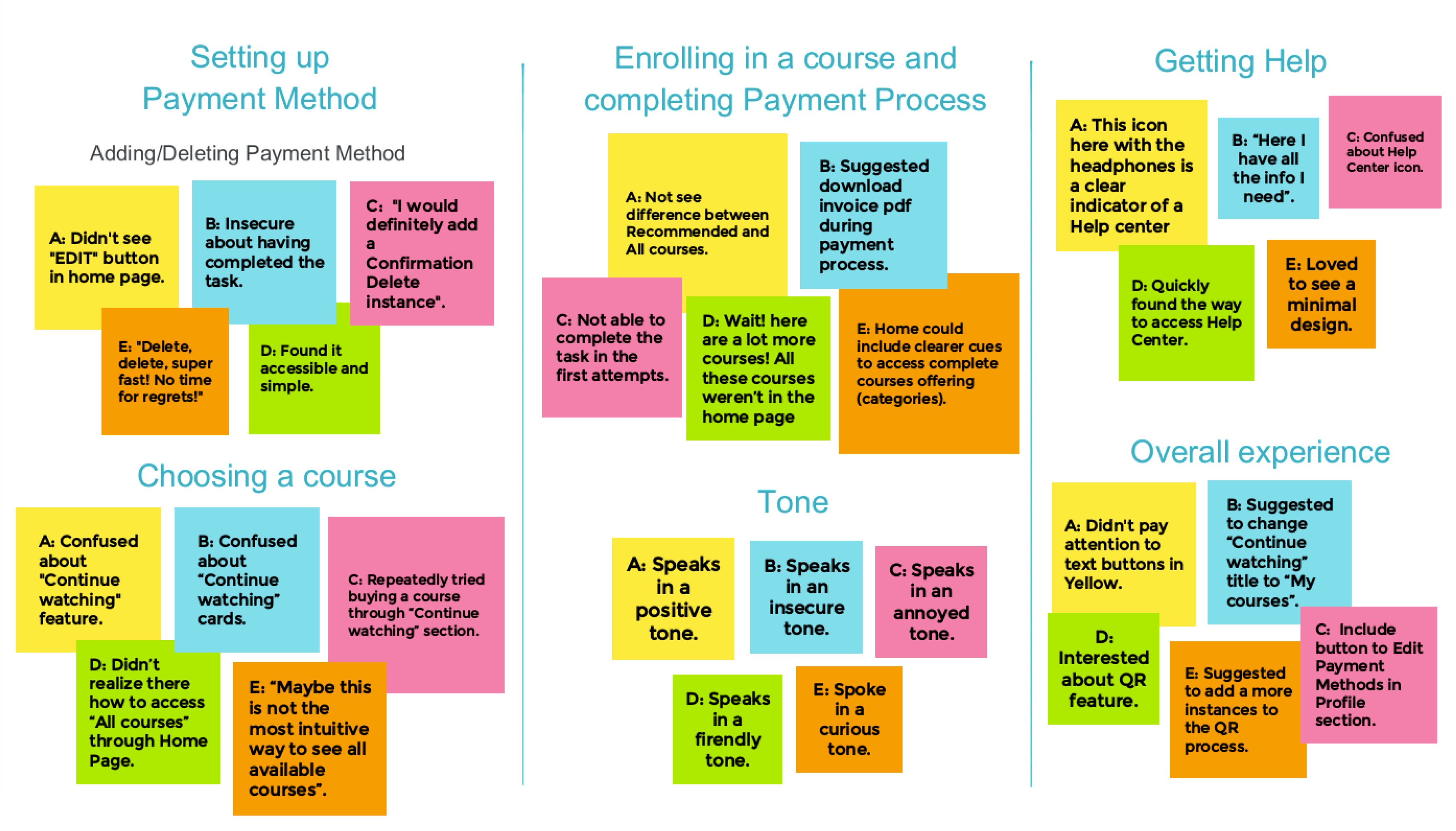
Usability study
findings
I conducted two rounds of usability studies. Findings from a the
first study helped guide the designs from a wireframes to mockups.
The second study used a high-fidelity prototype and revealed what
aspects of the mockups needed refining.
Round 1
findings
- It is not possible to change payment method during purchase
process.
- It’s not clear how to edit payment method.
- Iconography in footer menu is not clear.
Round 2
findings
- Accessing the complete course offering is hard to do.
- “Continue Watching” section is confusing.
- QR payment flow needs work.
We used an affinity diagram to separate the data into groups of
tasks which were further categorized by areas for improvement in
Payment method, Choosing a course, Enrolling in a course, Completing
Payment process, getting help and the overall experience.
Refining the Design
Early designs required some customization such as iteration of
iconography in footer menu. After the first usability study, I
completely iterated the Payment Flow. Users clearly expressed the
need to change payment method during purchase process. I removed the
Main payment method which was no longer needed in the new version.
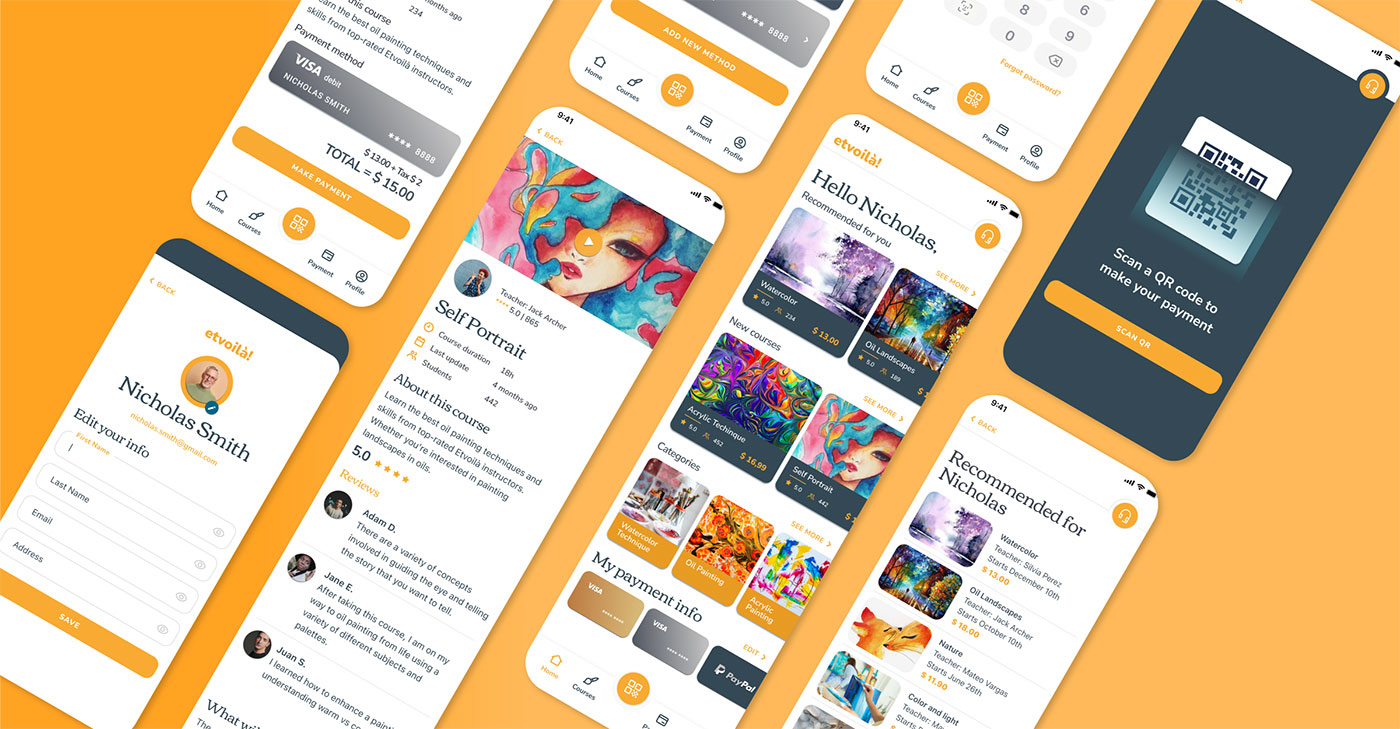
Mockups
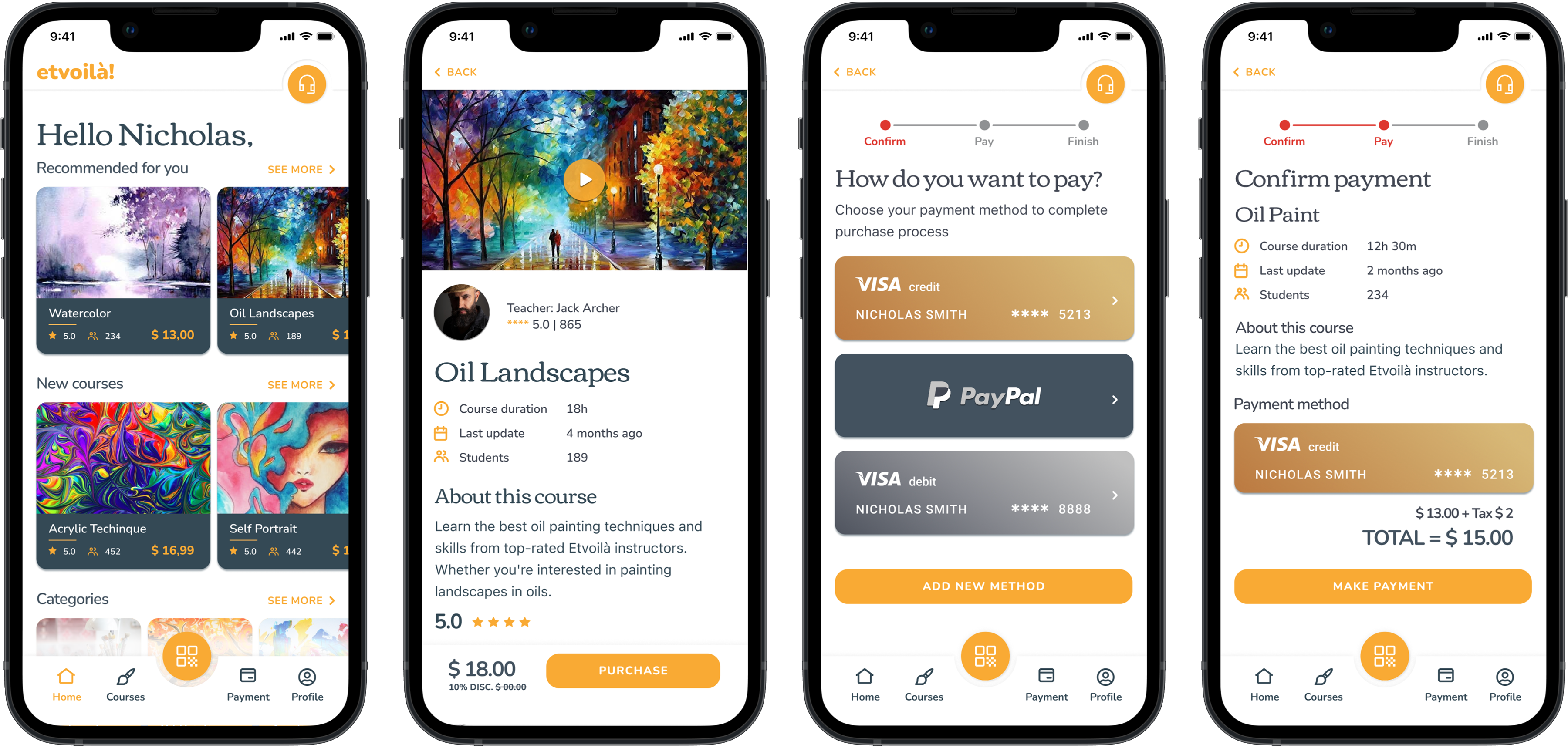
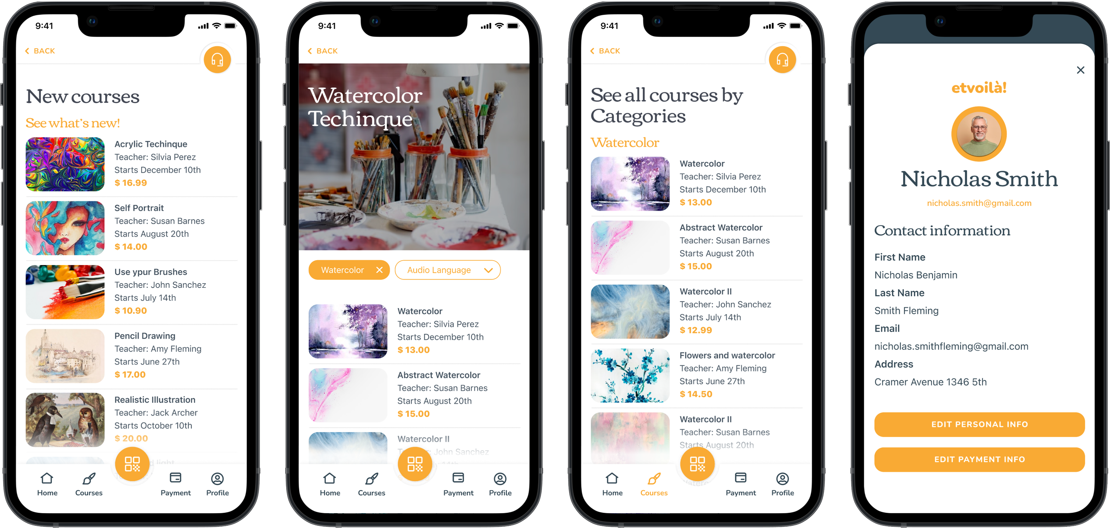
High-fidelity prototypes
The final high-fidelity prototype presented completed and polished
user flows for selecting and purchasing courses. It also met user
needs for reassurance when making a payment and availability for
chat support 24/7.
 HI-FI
HI-FI
Style Guide
Combining incredibly hi-contrast colors and two family fonts, I
created etvoilà! design system.
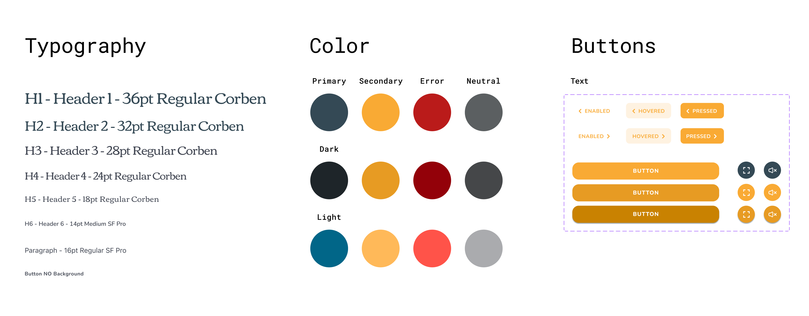
Accessibility considerations
HI-contrast color palette for visually impaired users.
Contrast Ratio: 4.85:1
No use of affordances or complex cues such as 3 dots or burger
menus.
Detailed imagery for credit cards and payment methods.
Phone vibration when a transaction is completed.
Lengthened time-out during payment process.
Navigation through text buttons and icons as an alternative for
gestures.
Footer menu includes icons and text.
Takeaways
Impact
Project goal was achieved. In the 2º Usability Study every
participant was able to enroll in a course and felt reassured when
making a payment through the app.
Quote form Participant Nº 2:
“I find it easy because in the end, every step you take is
guiding you to complete the payment process”.
What I learned
I learned to never underestimate the opinions of the users. Every
single one of the 10 people who participated in my Usabilities
Studies provided brilliant insights that allowed me to continue
working and improving on my design. Looking back to my first LO-FI
prototype and how everything changed, I learned that what I think
users need is almost never what they really need. Testing prototypes
with actual users is certainly the most important part in the Design
Process.